
“Which Wall Decor Trends Work Best for Small Modern Apartments?” is a collaborative post.
Most people treat the walls of a small apartment like a high school locker. They slap up a random assortment of postcards, tiny mirrors, and cheap prints, hoping it creates a “vibe.”
It doesn’t.
It creates visual noise. When you live in 600 square feet or less, visual noise is your enemy. It makes the walls feel like they are closing in on you. I have walked into studio apartments where the tenant tried to do too much and I literally felt my blood pressure spike.
You need a strategy. You need to stop buying things just because they are cute in the store. Here is what actually works when you are tight on space, based on years of fixing other people’s decorating mistakes.
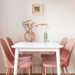
Large Wall Art and Framed Poster Solutions
Small space owners have this weird instinct to buy small art. It seems logical. Small wall, small picture.
Wrong.
A bunch of small frames creates a cluttered grid that your eye has to jump around to process. It is exhausting. You want the opposite. You want one massive anchor piece that dominates a wall.
I am talking about oversized art. Think 24×36 inches minimum.
This tricks the brain. A large scale piece implies the wall is big enough to handle it. It expands the room. I had a client last year with a shoebox living room in the city. We took down her twelve tiny botanical prints and put up a single, large-scale abstract piece. The room immediately felt 30% larger.
If you are on a budget, this is where a high-quality framed poster saves the day. I don’t mean the shiny paper stuff held up with sticky tack. Buy a poster with heavy matte paper, get a frame that actually has some weight to it, and use glass. When you treat a poster like fine art, it becomes fine art.
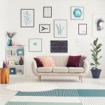
Grid Gallery Wall Layouts for Small Spaces
Gallery walls are trendy. I know. Pinterest loves them. But unless you have the eye of a curator, your gallery wall probably looks like a mess.
In a small apartment, a scattered gallery wall makes the ceiling feel lower. If you absolutely must group photos, you need rigid structure.
Forget the organic, “cloud” arrangement. It looks messy in tight quarters. Go for a grid. Nine identical square frames hung with laser-level precision.
The spacing is non-negotiable here. Two inches between frames. Not three. Not one and a half. Two. I use a spacer block when I install these because human eyes are terrible at judging distance. The repetition calms the chaos. It turns nine photos into one cohesive unit.
Styling a Customized Gift Photo for Modern Aesthetics
We all want our homes to feel personal. You want to see your friends, your dog, that trip to Cabo. But nothing cheapens a modern aesthetic faster than bad photo displays.
Color snapshots are visually loud. They have different lighting, different palettes, and red eyes. When you plaster them everywhere, it looks like a scrapbook exploded.
Here is the fix: Standardization.
Convert everything to black and white. It strips away the distracting colors and leaves you with the subject and the contrast.
If you received a customized gift photo from a friend or partner, do not just lean it against a stack of books. That looks like an afterthought. Elevate it. Get a custom mat cut for it. A large white mat with a smaller photo in the center creates negative space. That negative space allows the eye to rest. It makes a budget print look expensive.
Strategic Mirror Placement to Increase Visual Space
Everyone knows mirrors make rooms look bigger. That is old news.
But most people hang them in the wrong spot.
I walked into a place last week where the guy had hung a massive mirror directly across from his open kitchen shelving. So when you sat on the couch, you saw the kitchen clutter twice.
A mirror doubles whatever it reflects. Do not let it double your mess.
Hang it perpendicular to your best light source. If you have one good window, the mirror should catch that light and bounce it into the dark corner of the room. It acts like a second window. This isn’t magic. It is physics.
Vertical Wall Decor Tips for Compact Rooms
In a small footprint, you run out of floor space fast. You have to use the vertical real estate.
Most people hang art at eye level. In a small room with low ceilings, try hanging art slightly higher, or use vertical aspect ratios. Tall, skinny art draws the eye up.
I often use floating shelves for this. Not for books. For art. A slim ledge mounted high up allows you to layer pieces. It adds depth without protruding into the walking path.
Final Rules for Modern Small Apartment Decor
You have to be ruthless.
Every item on your wall needs to earn its rent. If it is small, dinky, or there just because you “needed something for that spot,” take it down.
Leave the wall blank until you find the right piece. Negative space is better than bad decor. A blank wall feels spacious. A wall covered in junk feels desperate.
Start with one big piece. Get the lighting right. And for the love of architecture, stop using sticky tack.


Comments are closed.